As summer kicks in and temperatures rise, so can the volatility in the stock market. It’s a phenomenon that’s often overlooked but can provide useful insights for investors looking to navigate through potentially choppy waters. This article discusses a handy tool that can help – a chart. Let’s explore how a summer market top chart can facilitate one’s navigation through the summer trading season.
First, let’s demystify the term summer market top. Referred to by some as the summer sell-off, it’s a period usually around June to August when the stock market experiences a dip or even a decline in its performance. Historically, this is the time when many traders and investors go on holidays, causing reduced trading volumes, and by extension, potential market volatility. A summer market top chart is, therefore, a graphical representation capturing these market behaviors.
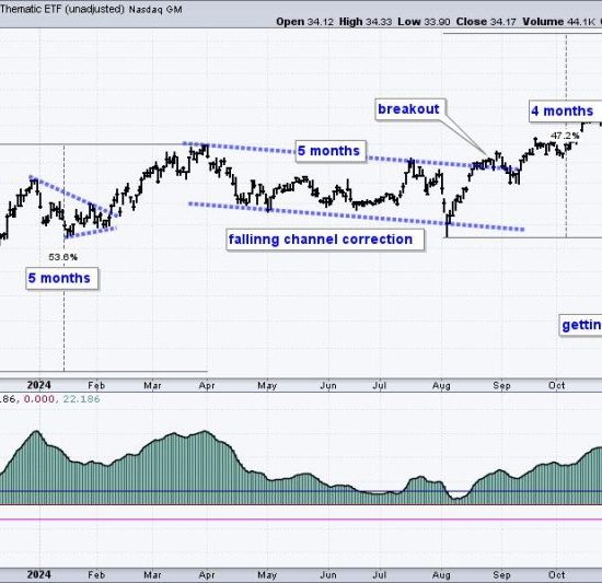
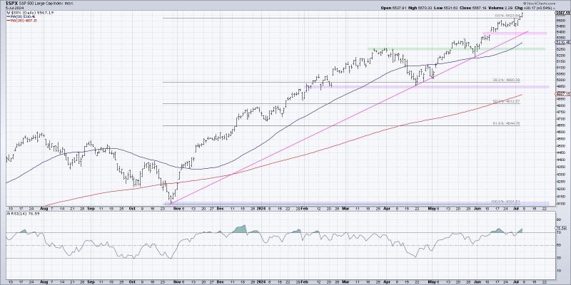
To make the most of a summer market top chart, it’s imperative to understand its components which include, but are not limited to, stock prices, trading volumes, and market indices across multiple time frames. An effective chart should not only reflect daily trends but should also provide monthly, quarterly, or even annual visual comparisons.
For example, the stock prices plotted against time can give an intuitive picture of the stock’s performance. A rising line indicates a bullish trend (good for buying), while a falling line denotes a bearish trend (ideal for selling or short selling). Meanwhile, the trading volume bars can help gauge market sentiment. High volumes could mean there’s an intense trading activity, while low volumes may suggest investor indecision or lack of interest.
Market indices, on the other hand, can offer a broader perspective. By observing how indices such as the Dow Jones Industrial Average (DJIA), NASDAQ Composite, and S&P 500 behave during summer, one can better appreciate the market’s overall direction. For instance, if these indices are moving upward during summer, despite the historically experienced lull, it might signal a stronger-than-usual market.
Critically, a well-organized summer market top chart should feature clear visual cues. Its layout should allow quick interpretation of complicated data, and colors should be optimally used to highlight essential points or trends. For instance, red could be used to indicate bearish trends, while green could be utilized for bullish patterns.
Regardless of the data involved, there are two different approaches used in charting– technical and fundamental analysis. While the former focuses on price movement and pattern recognition, the latter delves into economic and financial factors, as well as company-specific information. A combination of both can provide more holistic insight.
Lastly, it’s essential to remember that charts, including those for summer market tops, are not crystal balls but tools to guide decision-making. They depict history, patterns, and trends – not certainties. Utilizing them in conjunction with other trading strategies and keeping abreast with broader economic indicators and emerging market news can significantly aid investors in their quest to navigate the summer market.
In summary, a summer market top chart is a powerful assistant that can help investors understand potential market swings during the summer months. Recognizing its components, learning to interpret them, and coupling them with other trading tools and strategies can dramatically enhance one’s stock market journey during the rollercoaster that could be the summer trading season.