Body:
The projected potential end of a bear market is always a critical point for investors. Those who are able to accurately predict when the market has bottomed will potentially reap great rewards. However, this prediction game is often as much an art as a science. With that in mind, here are three key charts that investors should be keeping their eyes on to answer the age-old question, Have we bottomed?
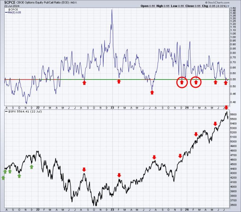
1. Market Sentiment Chart:
Market sentiment analysis can often provide key insights into potential market trends. This chart usually tracks investor sentiments through various indicators like the Bull/Bear ratio, which divides the percentage of bullish investors by bearish ones. Those who are bullish believe that the market will rise, while those who are bearish predict a decline. When sentiment is overly pessimistic (an elevated ratio of bears to bulls), it may signal a market bottom, particularly in conjunction with the other charts discussed here. Experts often use such surges in pessimism combined with other indicators to anticipate market recovery.
2. Market Volatility Index (VIX) Chart:
The Volatility Index or VIX, often referred to as the ‘fear gauge’, measures the market’s expectation of future volatility. It is a helpful tool for anticipating bottoms because it tends to shoot up in times of fear, stress, and uncertainty. While a rising VIX doesn’t necessarily indicate a bottom, a VIX that has spiked and then begins to subside can often signal that the worst of a decline is potentially over, and that we may be at or approaching a bottom.
3. Moving Averages Chart:
The moving averages chart is traditionally one of the most reliable indicators of market trends. This chart plots an asset’s average price over a certain period, thus smoothing out short-term volatility and providing a clearer picture of the overall trend. Examinations of moving averages, such as the 200-day or 50-day moving averages, can provide potential signals for a market bottom. Historically, when short-term moving averages cross above long-term averages (a bullish crossover), it’s a positive sign, which could indicate a possible business cycle bottom.
Usage of these charts to anticipate market bottoms, as with all investment analysis, requires a keen eye and an understanding of the broader economic context. These charts should not be used in isolation, but rather as part of a more comprehensive assessment of the market’s conditions, movements, and underlying fundamentals.
Monitoring these three charts closely could provide investors with valuable insights and potentially radio signals about when the market reached the bottom. However, it’s crucial for investors to remember that forecasting a market bottom is inherently difficult and uncertain. Charts like these should be used to inform decision-making, not substitute it. So, while these charts can suggest if we have hit the bottom, investor vigilance, patience, and thorough analysis remain crucial.
Remember that no single chart or combination of charts can unequivocally predict the end of a bear market. Each of these experiences should be used as a tool, not a crystal ball. While they may guide us closer to answering the question Have we reached the bottom?, making definitive pronouncement is always a challenge as it’s an interplay of multiple factors—economic indicators, geopolitical events, capital flows, investor sentiment, regulation, and more. It takes collective data and informed interpretation to make a reasoned judgment about the market’s movement.