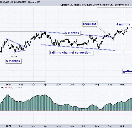
The first chart that investors should keep an eye on during a market pullback is the S&P 500 Index. The S&P 500 is a stock market index that measures the performance of 500 large companies listed on U.S. stock exchanges. It is one of the most commonly followed equity indices and is considered to be one of the best representations of the U.S. stock market.
When there’s a pullback in the market, the S&P 500 chart often displays useful trends. Investors can analyze the moving averages, support or resistance levels, and price patterns. The 50, 100, and 200-day moving averages can shed light on short and long-term trends in the market. Support and resistance levels can help identify key prices at which the index could potentially reverse its trend, while detecting any price patterns can provide insight into possible future movements.
Secondly, the Volatility Index (VIX) chart also brings valuable information during times of market pullback. The VIX is a real-time market index representing the market’s expectation of 30-day forward-looking volatility. It is calculated from the real-time price of options on the S&P 500 Index.
In simple terms, when VIX levels rise, it is a sign that traders’ anxiety is increasing, and there might be a greater likelihood of large price swings in the market. Conversely, when VIX levels are low, it can suggest that market participants are complacent and a pullback could be on the horizon. Therefore, keeping an eye on the VIX chart during market pullbacks can give traders and investors a sense of the market’s level of fear or complacency, helping them position accordingly.
Another crucial chart to monitor during a market pullback is the Relative Strength Index (RSI). The RSI is a momentum oscillator that measures the speed and change of price movements. The RSI oscillates between zero and 100. Traditionally the RSI is considered overbought when above 70 and oversold when below 30.
During a market pullback, investors can watch the RSI for signs of oversold conditions – these could be potential buying opportunities if the long-term outlook for the market remains positive. Conversely, if the RSI is heavily into overbought territory as the market begins to pull back, it could indicate that the market is due for a correction.
One final chart that could provide valuable information during a market pullback is that of the Advance-Decline Line. This chart represents an indicator that shows the number of advancing stock issues against the number of declining issues.
When there’s a rising Advance-Decline Line, it indicates that more stocks are participating in the rally, which is a bullish signal. When the Line is falling, it suggests that more stocks are declining than advancing, which is a bearish signal. Studying this chart during a market pullback can give us an idea about the breadth of the market, which is an important factor in market health.
To summarize, keeping an eye on the S&P 500 Index chart, the Volatility Index (VIX) chart, the Relative Strength Index (RSI), and the Advance-Decline Line during a market pullback can provide investors with a wealth of information. This data, coupled with prudent risk management and a sound investing strategy, can help traders navigate the tricky waters of a market pullback.